Landing pages play a very special role in PPC advertising; they act as a bridge between clicks and conversions.
Think about it: You’ve been intrigued enough by an ad to click on it, but you’re taken to the website’s homepage. There are tons of things to look at and places to click, and none of them are really relevant to the ad you clicked in the first place. Your attention falters, and you close the page.
If you don’t use landing pages or you use them incorrectly, this is what will happen. People clicking your ads will falter, and they’ll close the page. No conversion = wasted money.
In this article, we’ll cover everything you need to know about landing pages - why they’re useful, how to build effective ones, mistakes to avoid, and more.
Here’s what we’ll cover:
- The Importance of Dedicated PPC Landing Pages
- Key Elements of a High-Converting Landing Page
- Design Principles for PPC Landing Pages
- Creating Persuasive Content
- Technical Aspects to Consider
- A/B Testing and Iterative Design
- Common Mistakes to Avoid
- Examples and Case Studies

The Importance of Dedicated PPC Landing Pages
Landing pages have the highest conversion rate (23%) of all sign-up forms, and businesses taking active steps to optimise their landing pages can expect to see conversion rate upticks of 30% or more.
If that doesn’t make the case for investing time and energy into high-quality landing pages, we don’t know what will.
In the intro, we mentioned the role of landing pages as bridges between clicks and conversions, which reduce the chance of a user’s attention faltering. This is where the two most fundamental design considerations of a landing page come into play:
- The ad promise should be aligned with the landing page content. This consistency boosts trust and holds attention, increasing the chance of the user progressing along the conversion pathway.
- The landing page should be free of distractions. The only interaction a user should be able to take should be directly related to the ad promise and page content. This means no nav menus, no conflicting CTAs, and no junk. Just a very clear, streamlined set of interactions (i.e. ‘First name’, ‘Email address’, ‘Sign up’).
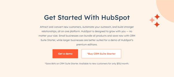
One of HubSpot’s landing pages. The search term was ‘HubSpot’, and the page is fully aligned with this search intent: there’s some top-level info and two ways to engage with the brand. There is no nav bar, no clutter, and two targeted CTAs.
The greater the discrepancy between ad promise and page content, and the more distractions on the landing page, the more likely a user is to drop off and exit the conversion pathway.
Key Elements of a High-Converting Landing Page
Within the two fundamental design considerations outlined above, there are a few additional design elements you should keep in mind. These will contribute to the user’s perceived feelings of trust and will help to encourage them along the conversion pathway.
Let’s look at each, with reference to the HubSpot example above:
Compelling Headlines
The headline should be concise and clearly linked to the ad copy and the user’s search intent. The flow between the user making a search, seeing the ad, and engaging with the landing page content should be harmonious and natural.
HubSpot’s headline “Get Started With HubSpot” is a great example: Four words, a very clear message, no clutter. A good headline invites the user to do something and requires very minimal mental processing to properly engage with.
Clear and Persuasive CTAs
Concise and clear are buzzwords for CTAs, too, whether you’re leading a user to another part of your site, collecting their information, or something else.
CTA buttons should be prominent, they should stand out, and the copy should be clear. HubSpot’s examples - “Get a demo” and “Buy CRM Suite Starter” - both lead with verbs, and both clearly communicate to the user what the expected interaction is. The use of two buttons with different tiered CTAs is good to give the user options without overwhelming them.
If you’re collecting user information - on a lead capture page, for instance - use as few fields as possible. Asking for too much info will put users off and maximise their risk of dropping off.
Relevant Visuals and Media
Any visuals on a landing page should contribute to the harmonious journey we mentioned between making a search, clicking an ad, and engaging with the landing page content. If the landing page is for a software trial, a screenshot or short video of key features would work well. A picture of the company’s head office or a cute cat would not.
HubSpot doesn't use any imagery in the example above, as such. They opt to only use visual elements and colours that allude to the overall brand. This is a great way of contributing to a coherent brand experience and is highly encouraged.
Trust Indicators
A user is already taking a chance by clicking on your ad. They’re acknowledging that they may part with their hard-earned cash as a result of the click, and they need to be reassured throughout that such a transaction would be worth their while.
As well as copy, headlines, CTAs, and imagery that provide context to the ad, they’ll also be looking out for trust signals to demonstrate that your brand is credible and that the product or service being advertised is relevant to their needs.
They’ll want to see things like:
- Statistics
- Social proof, like reviews, testimonials or star ratings
- Special offers (see HubSpot’s example above)
- Accreditations
- Awards
Be careful not to overdo it here, however. Spamming the user with tons of award logos and reviews will overwhelm them and distract their attention from the main landing page content. The right balance of trust indicators varies on the page, the niche, the trust indicators themselves, and lots of other factors. A/B testing is recommended to find out which combinations work best.
Design Principles for PPC Landing Pages
With the fundamentals and the key page elements identified, let’s take a look at design principles. These factors will help users engage most effectively with your landing page content, facilitating them to cross the bridge between click and conversion.
Mobile Responsiveness
Landing pages will be viewed on a variety of devices, so they must have a responsive design. Users have zero patience for pages which don’t load properly on their devices, and they will decide to exit the page before looking for ways to resize it.
Thankfully responsive design is a widely understood and commonly used aspect of web design, so most developers and page creation tools will have it in their processes already. But we still recommend double-checking and taking the time to test your pages on a selection of devices.
Visual Hierarchy
The visual hierarchy of a landing page refers to the order of its content, and the F-Pattern is a useful way to conceptualise a user’s likely engagement.
Think of the letter F:
- A user is likely to read the headline and perhaps the first line or two of the copy horizontally
- They are then likely to scan down the page a little bit until they see something else that piques their interest
- At this point, they’ll read horizontally again
- Then, they’ll scan down some more
Ensuring your content is structured and optimised accordingly maximises the chance of a user engaging. A clear headline and compelling copy will encourage this initial horizontal engagement; clearly, signposted information and CTAs further down the page will attract repeat horizontal engagement.
We recommend making sure your landing page is easily scannable, with key information easily visible as users scroll down.
Whitespace
A landing page should be spacious and inviting. We’ve already discussed the importance of removing unnecessary navigation like nav bars and excess CTAs: lots of whitespace between elements contributes to this streamlined, easy to interact with aesthetic.
Let’s take another look at HubSpot’s page. Do you notice how much empty space there is?
This really puts the content front and centre. There’s nothing to distract you from the headline, copy, and CTAs, meaning your attention is more likely to stay directed at the stuff they want you to pay attention to.
Copywriting for Conversions
Effective copywriting is a crucial part of web design, whatever type of page you’re building. You need words that engage users, clearly communicate information relevant to their needs, and retain their attention. It’s a tricky balance, but getting it right pays dividends.
In PPC landing pages, your copy has to work even harder. Users’ expectations are much more narrow, and their attention is much more limited. You need to convey almost instantly how this page addresses their needs and what you want them to do, and you need to be convincing enough to get them to do it.
Creating Persuasive Content
That last point about copywriting deserves a deeper dive, so here we go. Let’s look again at HubSpot’s landing page:
- There are 4 words in the headline
- 53 words of copy
- 7 words across 2 CTAs
- 13 words of extra info
That’s 77 words total: fewer than 100 words to do everything outlined above.
To be effective, landing page copy must be persuasive. You are conveying information, but the focus is much more narrow than on a service page or other type of web content. Instead of giving general, top-level information, or in-depth information about granular things, you’re just trying to quickly communicate the following things:
- Why this page is relevant
- What you’re offering
- How the offer addresses a user’s pain points
- What they need to do
That’s it.
This is another area where A/B testing is useful: comparing engagement between different copy lets you make gradual refinements and increase the engagement rate over time.
Technical Aspects to Consider
We’ve now addressed fundamentals, key page elements, design principles, and copywriting principles. This is everything the user sees when they click through to the landing page and is very important. But just as important, is what’s going on under the bonnet.
Load Times
A landing page needs to load quickly. We know already that user attention is limited: if your page takes ages to load, they’ll go elsewhere.
Trimming page elements should lead to improved load times, but there are other steps you can take here as well:
- Compress images: Use next-gen formats like .webp if possible, compress your image files, and only serve images at the required resolutions.
- Minify CSS, JS and HTML: Trimming unnecessary characters from code reduces network payload and speeds things up.
- Use a CDN: Storing your landing page content on intermediary servers that are closer geographically to your user further reduces load time.
These factors might only make incremental improvements, but when it comes to PPC landing pages, this is where you stand to make the most gains.
Seamless Navigation
We’ve touched on this already, but it’s worth mentioning in the technical context. Rather than just hiding navigational components of page templates, they should be removed entirely from the code. This will contribute to load times and reduce the risk of incorrect rendering.
CTAs should be tested strenuously across all types of devices to ensure that they work. Users who come across issues with CTAs will leave, so you need to have all eventualities covered.
Tracking
Knowing exactly how users engage with your landing page makes ongoing refinement possible. You can use tools like Hotjar to visualise engagement, showing which content people are seeing and which they’re skimming.
A/B Testing and Iterative Design
The key thing to remember with PPC landing page design is that you do not put a page live and leave it alone. You monitor engagement, and you make continuous improvements based on what you learn.
A/B testing is very important here. Comparing the performance of subtly different layouts, headline phrasing, copy, CTA phrasing and so on lets you optimise each element of your landing page over time. And because you’re tracking real metrics in real-time, these improvements are guided by past engagement and correlate with improved engagement.
Common Mistakes to Avoid
Let’s distil down what we’ve learned above into common PPC landing page mistakes that should be easy to avoid:
- Overloading users with information: Giving users too much to engage with will most likely break their engagement and cause them to exit the page.
- Unclear next steps: If the journey from click to conversion isn’t clearly signposted by copy and CTAs, users will likely exit.
- Poor page structure: If the landing page doesn’t invite easy engagement, users won’t know where to look and, again, their attention will waver.
- Not enough trust signals: Users won’t continue their journey if they don’t feel they can trust your brand.
- Irrelevant copy: If the page doesn’t clearly address the user’s original need, they’ll look elsewhere.
- Too much info required: Asking for the user’s birthday, company name, middle name, and age when they just want to download an ebook will cause dropoffs. Only ask for what you need.
- Doesn’t work on their device: An unresponsive layout is pretty much a guaranteed engagement killer.
- Slow load times: Users won’t wait around! Making sure your landing page loads quickly will promote better engagement.
- Not learning from your mistakes: Not refining a landing page based on learning will mean that it continues to make the same mistakes.
Examples and Case Studies
We’ve rounded up a few examples of effective landing page design to put the concepts discussed in this article into context. For each, we’ve included a screenshot of what you see above the fold on page load, along with a breakdown of what makes the page effective.
Disney+
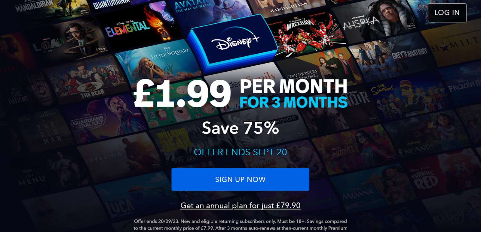
What makes it effective:
- Branding is immediately obvious: the brand name is front and centre, with all other visual collateral subtly emphasising brand content.
- Very concise copy: the headline conveys right away what the user can expect, and the two lines below offer six words of supplementary information: enough to give the user all the info they need.
- Clear CTA: “Sign up now” uses an action verb, creates a sense of urgency, and leaves no ambiguity.
- Great structure: Everything you need is in the middle of the page, and you don’t need to scroll. It’s easy for your eye to find and engage with the content as is.
- Good trust signals: There are T&Cs readily available for users who may be put off by the prospect of subscribing.
- No distracting nav: Except for a ‘Log In’ button for existing users, there are no buttons or navigational cues except for the CTA, making it easy for the user to take the desired action.
Legal & General
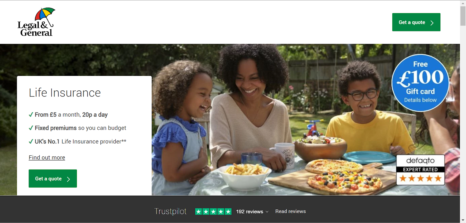
What makes it effective:
- Streamlined nav: The top bar contains a logo for brand recognition and a second CTA button: no confounding buttons or nav prompts.
- Concise copy: There’s a headline and three bullets, with key phrases bolded for even easier scanning.
- Unambiguous CTA: three words, with an action verb to guide the user definitively to the desired action.
- FOMO: Users are offered a £100 gift card for engaging with the offer, creating a nice sense of urgency.
- Lots of trust signals: A 5-star Trustpilot rating based on customer reviews and a 5-star de facto rating based on expert opinion immediately demonstrate credibility.
- Pleasant imagery: The light-hearted image sets the scene without touching on the potential negative implications of the service.
Replicon
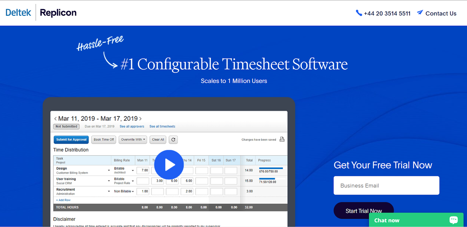
What makes it effective:
- Streamlined Nav: There’s the company and software name, along with a phone number and contact us link. While this is more nav options than the previous two examples, it’s still fairly clear what the desired course of action is.
- Clear copy: A headline and a line of copy with a bold claim that will resonate with most users. The playful ‘hassle-free’ callout catches the eye and provides additional info about the service.
- Imagery of the software: To show users right away what they can expect in terms of functionality and visual interface.
- It’s a video, too: Users can click the play button to see the software in action: great for people who are gathering information about potential solutions.
- Only one field to fill in: It would be very easy for the company to ask for name and telephone number, too, but they’ve resisted the urge: this minimises potential dropoff points.
- Clear CTA: three words again, with an action verb.
Two things stand out here as potential room for improvement - can you see what they are? If not, read on:
- The ‘Chat now’ button overlaps the CTA, which detracts slightly from the slickness of the page design.
- The software screenshot shows a date four years in the past, raising questions about whether the visual assets are out of date. This is subtle but may be enough to convince a user to leave and look elsewhere.
In Conclusion
Landing pages are a critical part of the PPC ecosystem. They act as a bridge between click and conversion, and leading users across this bridge is a delicate process. You need to make sure that the landing page invites easy engagement and communicates a very precise type and amount of information, all while retaining a user’s already limited attention.
There are fundamentals that will help you design an effective PPC landing page, and ongoing monitoring and refinement will facilitate performance improvements over time. This is an area where investing time and energy will pay off, so don’t be discouraged if it seems like a tall order.
Still looking for more information about PPC Services? We’ve got you covered. Find out more through one of the article below:
- B2B PPC: What is it & Why is it Important?
- PPC Management: How to Optimise Your Ad Campaigns
- PPC Strategy: A Comprehensive Guide
- PPC Keyword Research: A Comprehensive Guide
- PPC Ad Copy: A Comprehensive Guide
- PPC Tracking: A Comprehensive Guide
- PPC Analysis & Reporting: A Comprehensive Guide
- Why PPC Training Makes Sense for Marketing Managers
- How to Structure your PPC Campaign for Success
Or, why not check out our Definitive Guide to PPC Services.